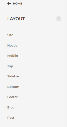
Layout > Site
< HOME
Site
Header
Mobile
Top
Sidebar
Bottom
Footer
Blog
Post

Style
General
Components
- Accordion
- Alert
- Align
- Animation
- Article
- Background
- Badge
- Base
- Breadcrumb
- Button
- Card
- Close
- Column
- Comment
- Container
- Countdown
- Description List
- Divider
- Dotnav
- Drop
- Dropbar
- Dropdown
- dropnav
- Form
- Grid
- Heading
- Height
- Icon
- Iconnav
- Label
- Leader
- Lightbox
- Link
- List
- Margin
- Marker
- Modal
- Nav
- Navbar
- Notification
- Offcanvas
- Overlay
- Padding
- Pagination
- Placeholder
- Position
- Progress
- Search
- Section
- Slidenav
- slider
- Sortable
- Spinner
- Sticky
- Subnav
- Tab
- Table
- Text
- Thumbnav
- Tile
- Tooltip
- Totop
- Transition
- Utility
- Width
Pages
No articles found.
The list shows uncategorized articles and is limited to 50. Use the search to find a specific article or an article from another category to give it an individual layout.
By default, only uncategorized articles are referred as pages. Change the category in the advanced settings.
Templates
Create site-wide templates for pages and load their content dynamically into the layout.
If multiple templates are assigned to the same view, the template which appears first is applied. Change the order with drag and drop.
Menus
Navbar Position
Header Position
Toolbar Left Position
Toolbar Right Position
Dialog Position
Mobile Navbar Position
Mobile Header Position
Mobile Dialog Position
Display a menu by selecting the position in which it should appear. For example, publish the main menu in the navbar position and an alternative menu in the mobile position.
If you are creating a multilingual site, do not select a specific menu here. Instead, use the Joomla module manager to publish the right menu depending on the current language.
Modules
Only display modules that are published and visible on this page.
none
breadcrumbs
sidebar-right
Site
Logo Text
The logo text will be used, if no logo image has been picked. If an image has been picked, it will be used as an aria-label attribute on the link.
Logo Image
Select your logo. Optionally inject an SVG logo into the markup so it adopts the text color automatically.
Width
Height
Setting just one value preserves the original proportions. The image will be resized and cropped automatically, and where possible, high resolution images will be auto-generated.
Inverse Logo (Optional)
Select an alternative logo with inversed color, e.g. white, for better visibility on dark backgrounds. It will be displayed automatically, if needed.
Mobile Logo (Optional)
Select an alternative logo, which will be used on small devices.
Width
Height
Setting just one value preserves the original proportions. The image will be resized and cropped automatically, and where possible, high resolution images will be auto-generated.
Mobile Inverse Logo (Optional)
Select an alternative logo with inversed color, e.g. white, for better visibility on dark backgrounds. It will be displayed automatically, if needed.
Dialog Logo (Optional)
Select a logo, which will be shown in offcanvas and modal dialogs of certain header layouts.
Width
Height
Setting just one value preserves the original proportions. The image will be resized and cropped automatically, and where possible, high resolution images will be auto-generated.
Layout
Image
Upload an optional background image that covers the page. It will be fixed while scrolling.
Text Color
Toolbar
Breadcrumbs
Show or hide the home link as first item as well as the current page as last item in the breadcrumb navigation.
Breadcrumbs Home Text
Enter the text for the home link.
Main Section Height
On short pages, the main section can be expanded to fill the viewport. This only applies to pages which are not build with the page builder.

